
Website designs are bound to change with time and user behaviour. A quick way to know if your website needs a revamp is to see what your peers are doing. Yet, that’s just a starting point, since you obviously want to outdo them.
Websites are the face of your business, more so after the pandemic. With businesses across industries scurrying online to survive and thrive, stellar website experiences are table stakes. While a consistent stream of traffic pouring in is a good sign, it’s when viewers stay longer and engage with your content that actually pushes the needle towards conversions.
There are many reasons why your customers visit your website. From researching and comparing a product/service, to finding support during or after purchasing a product, or simply to get to know your brand. Whatever the case, investing in a timely revamp to ensure you meet their expectations and are aligned to prevailing industry standards will help you carve a niche in their minds.
To help you discern and analyze whether your website needs a brand new avatar, you need to dig deeper and ask yourself the following questions.
Does your website reflect your brand and the value you provide?
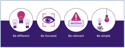
It’s important to present a clear brand message throughout your website.You won’t like users to land on your website and wonder if you are the same brand when compared to your other digital or offline marketing communication. Ensuring this coherence is crucial when tying each of your content pieces together. Pay close attention to your brand positioning, mission statement, and product value promise to present the most distinctive benefits and selling points about your offering. Savvy businesses will do well in paying attention to these fundamental 4 steps to get it right:

Your website should be expressing the value your business provides through simple, clear copy and powerful imagery. If visitors are greeted with superfluous text and imagery they’ll leave a website within the first 10–20 seconds. How to avoid this? Ensure all the content you showcase answers ‘what’s in it for me?’ from a visitor’s perspective. That way you will be providing information with real value.
Ever heard of the phrase - Happy customers are your biggest advocates?
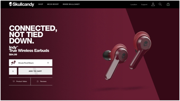
A dedicated ‘Testimonials Page’ that highlights positive customer reviews is quite effective in boosting business credibility and earning the trust of potential customers. As for creating a visual resonance, Skullcandy’s website does this perfectly by luring shoppers with stunning imagery, and plenty of visual elements making it hard not to stop and marvel and their appealing product designs. A link to customer reviews is also boldly placed within the first scroll of the product page, allowing potential buyers to find quick social proof or a reason to trustquality.

Is your UX on par with existing customer expectations?
Good design goes beyond aesthetics and focuses really on user experience. 85% of adults think that a company’s website when viewed on a mobile device should be as good or better than its desktop website. A non-responsive website design is the easiest way of handing over potential sales to your rivals. A consistently high bounce rate is a prime warning signto understand that your UX needs work and that the browsing experience you offer is not intuitive enough.
First impressions are everything. It takes 50 milliseconds (that’s 0.05 seconds) for users to form an opinion about your website. There’s no time for an elevator pitch online. Every word, design element, and navigation path have to work as hard as possible to keep them glued beyond the first few seconds, so much so that they inspire a repeat site visit.

Amazon is an excellent example of what a website should look like — its user-friendly design makes it easy for customers to find what they need. Despite having millions of products, Amazon does a great job of simplifying its interface, offering seamless navigation.
Notice how the search bar is prominent on every page. The search auto-complete, filtering and guidance functionality are well-wired to the user’s best interests and most common browsing behaviours. The algorithm also personalizes the homepage content to the user’s browsing history to better trigger future purchases.
Are there any technical aspects that need work?
People browse websites on different devices with different Internet speeds. This often impacts the display of information and the time it takes to load.
Aspects like well-written HTML codes, correct and appropriate use of stylesheets, and optimized integration of AJAX technology, flash, or other advanced features; all of these are indispensable to a well-designed and effective website. Errors in coding can often impact your website’s searchability and ranking leading to poor visits. Being diligent about such nitty-gritty is as important as working to fix them quickly as every poor impression affects conversion – not only now but in the long-term as well.
Here are some key focus areas you must check on while revamping your site in order to achieve maximum results:
Maintain visual hierarchy
According to The Aberdeen Group, businesses that utilize visual engagement tactics see an 83% increase in annual revenue compared to their competitors. One such tactic is visual hierarchy. This is nothing but organizing your content to guide the user’s eyes to the most important aspects of your website.
“Good design” includes basics such as white space, colour, positioning, device responsiveness, typography, and usability. Any amount of animation should be well thought through and employed only to make a distinctive product statement.
Ace navigation with intuitive thinking
Here’s the real test of patience. If a visitor can’t find what he wants in the time he expects, all your efforts could be down the drain. So, make navigation as intuitive as possible. Some best practices to keep in mind – your main menu should easily accessible from any page. The viewer should always know exactly where they are on your website and have minimum friction to get where they’d like to be.
This is no rocket science but depends on pure logic and a tad bit of understanding of human psychology. A good example in point would be Myntra. It has categories (e.g. ethnic wear) and sub-categories (e.g. Dupattas, lehengas, etc.) that make getting to where you want super-quick.
Make call-to-action buttons stand out
CTAs are done and dusted. But you need to think of getting people to act without sounding humdrum. Think of CTAs like those chocolate bars or chips you make a last-minute impulse purchase for, while you are waiting for checkout. For instance, instead of saying – Free trial. Say – Claim your month-long free trial now!
Develop smart content
Use smart content, also referred to as dynamic content. Smart content changes based on the viewer’s interests or past behaviour, if they have logged in, or with the help of cache/cookies.
Leverage good SEO tactics
Research keywords for your industry and target market, and integrate them into your website content, including site copy, page titles, meta descriptions, header tags, and URLs. Internal links improve SEO, so include them wisely.
Ensure your online and offline presence are in sync
Your company’s branding needs to be consistent and updated periodically on your website. A website revamp can help you stay on the ball, and experiment with reign UX trends to drive results.
Regular updates in terms of copy and some design tweaks can help witness some impact on traffic. Yet, a complete website revamp every 2-3 years is imperative to stay aligned to evolving industry standards.
For over a decade, leading organizations across industries have been seeking Urja’s expertise to help them provide their visitors with a website experience that meets global standards. To know how we can help you gain maximize ROI through your online presence, connect with us at marketing@urja.com
Leave a comment
Comments (0)